More is More: Maximalism in Album Art
·

·
The concept of Maximalism entails the celebration and incorporation of eclectic, vibrant abundance. It can be seen as a palpable reaction to the now drawn-out sensibilities of Minimalism and its 'less is more' motto. Maximalism, however, is much more than a filling in of negative space; it's born out of a necessity to experience things as whole and detailed—a void left by minimalist interior design, art, and now, minimalist thinking.
A great resurgence of Maximalism can be seen in the world of interior design. Within the art world, however, it has always been an ever-present stance, promoting over-stimulation and grandiose excess as the means to truly express and experience not only art but a passionate life.
Representing Maximalism in our art, rather than its inverse, gives us, ironically, room to better understand our current individual conditions.
A medium that has always experimented with this concept, not only in the way it's made (think Melt-Banana or Lightning Bolt) but also in how it is artistically depicted and conceptualized, is the world of album covers and artworks.
How to Tell if Something is Maximalist:
Much like Minimalism, a piece of art—be it music, interior design, or even clothing—can fall within a particular movement or art form and still be considered Maximalist.
Here are some defining characteristics of Maximalism:
1. Bold Colors and Patterns: Maximalist artworks often use bright, saturated colors and intricate patterns, creating a sense of vibrancy and energy.
2. Layering: Multiple layers of textures, images, and motifs are common, producing a dense and immersive visual experience.
3. Eclectic Influences: Maximalism frequently incorporates a wide range of styles and cultural references, blending different historical periods and artistic traditions.
4. Opulence and Luxury: There is often a sense of grandeur and opulence in maximalist art, with an emphasis on luxurious materials and elaborate compositions.
5. Emotional Expression: Maximalism can evoke strong emotions and a sense of exuberance or even chaos, reflecting the artist's personality and creativity.
Interpretation and Reception:
Maximalist art can be polarizing. Some appreciate its boldness and richness, while others may find it overwhelming or excessive. The movement challenges conventional ideas of taste and restraint, inviting viewers to explore the boundaries of creativity and aesthetic experience. Ultimately, it sparks a dialogue about the diversity of artistic expression and the subjective nature of beauty.
Notable Maximalist Artists:
• Kehinde Wiley: Known for his vibrant, large-scale portraits that combine contemporary African American culture with classical European portraiture.
• Yayoi Kusama: Famous for her immersive installations featuring polka dots and repetitive patterns.
• David LaChapelle: A photographer whose work is characterised by surreal, hyper-saturated images and elaborate staging.
1. Pure Comedy by Father John Misty:
Released: April 7, 2017
Designed by: Edward Steed
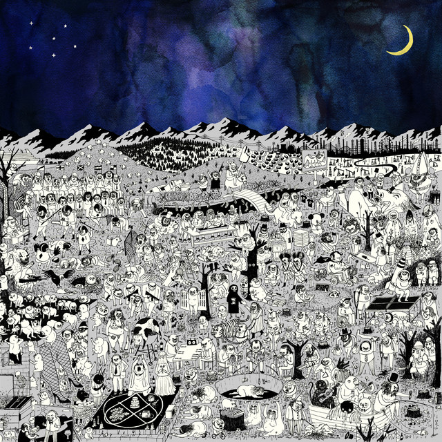
Cartoonist Edward Steed has always dabbled in sardonic humor, always twisting the lenses through which daily modern human activities can be observed and what the realities of them truly entail.
His time with The New Yorker had given him the space to spread his fatalistic worldview into his work, so when Josh Tillman, AKA Father John Misty, came to him to draw up a world that would best depict the corrupted, sinister, and existentially humorous human tendencies of the conceptually rich "Pure Comedy," the bedrock was already there.
The maximalist lens comes in through Steed’s journey from single panel and magazine cover work to the annals of album artwork creation (his first endeavor in this space).
A lot of Hieronymus Bosch was studied, admired, and modernized for this visual commentary on the absurdity of the human condition (think "The Garden of Earthly Delights" and "The Seven Deadly Sins and The Four Last Things").
To fully personify the universe of "Pure Comedy" within the context of a large landscape, especially that of a gatefold, seemed difficult, but the true freedom of the endeavor gave space to truly populate this landscape with as many ideas as could be thrown onto the board.
The album cover for "Pure Comedy" can be seen as an example of maximalist art in its complexity, density, and richness of detail. It embodies the "more is more" philosophy through its intricate, packed imagery and the layered meanings embedded within the illustration.
Overall, the album cover for "Pure Comedy" is a rich, complex work that visually represents the album's themes and the artist's satirical, critical approach to contemporary issues.
2. Hail To The Thief by Radiohead
Released: June 9. 2003
Designed by: Stanley Donwood
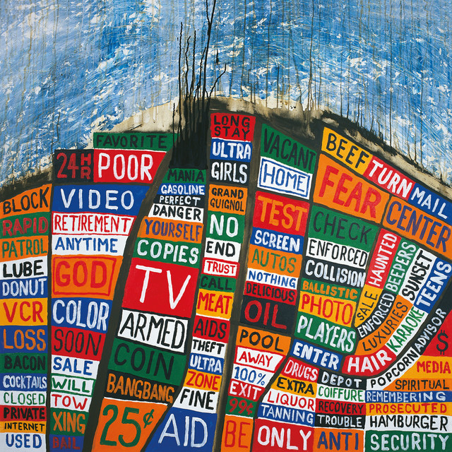
This is a key example of how maximalism can aid social commentary within art. Stanley Donwood has been the key orchestrator of Radiohead’s visual expeditions, whether designing their famous ‘Modified Bear’ logo or the wide array of textures and atmospheres that visually accompany their albums since ‘The Bends.’
With the album cover of "Hail to the Thief" and its subsequent album art, Donwood truly encapsulates the over-stimulating nature of American advertising, moral decay, and abstraction of 2003-Bush era America.
The process of creating the album cover involved Donwood sitting in the passenger seat during his and the band’s travels across highway-ridden Los Angeles, where he would observe the words and vibrant colors of signs and write them down. A barrage of bright vermillion and neon signs blinded Yorke and Donwood, accompanied by aggressive verbiage such as ‘Armed Response’ and ‘Bombardments’—all words readily accessible to anyone of any age driving down the busy, humid streets of LA.
After collecting these cut-up words from their origin, he placed them within blocks of colors that mimicked the limited color palette of these signs and then put them in geographical maps outlining prominent cities within America to showcase where the words came from. The word collage and its abrasiveness, using maximalist tendencies to encapsulate it all, have come to complement the ethos of the politically charged and world-weary universe of ‘Hail to the Thief.’
There are more of these concepts explored through his ‘Over Normal’ exhibit, where he later reincorporated the dizzying lines of spam mail he received from scammers and corporations throughout the early 2000s.
The Overnormailiser was a previous work he made that also used the info of spam emails as an attempt to overtly remind audiences that there is little to no control over the info that can barge in and remain within our consciousness. What better way to illustrate the same through maximalism as an ideological tool?
Buy "Hail To The Thief" on Vinyl
3. Sgt. Pepper’s Lonely Heart’s Club Band
Released: May 26, 1967
Designed by: Peter Blake and Jann Haworth
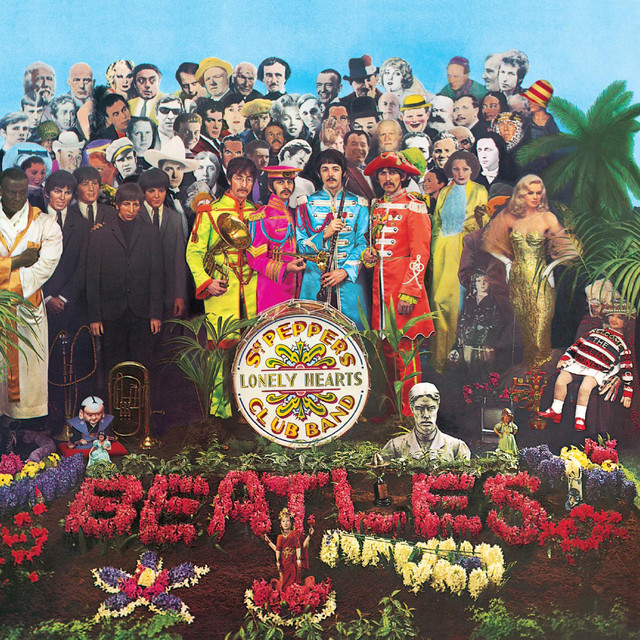
The cover, created by Peter Blake and Jann Haworth, is one of the most iconic and detailed album covers in music history. This is not only due to its encapsulation of the Hippie era (or the adoption of the same by the then-mainstream) but also because of its intricately detailed symbolism and vibrant imagery.
In a decade prior to the normalization of psychedelic albums in art and everyday visualizations, having such a vibrant cover was not as commonplace as it is nowadays.
The album cover itself features cardboard cutouts of figures and objects that have specific meanings or references, often relating to popular culture, history, or the band members' personal interests. This adds multiple layers of interpretation and invites viewers to explore the connections between these elements.
Themes of nostalgia meeting modernity pop up throughout the album, whether through sonic experimentation paired with traditional musical techniques or historical figures paired with contemporary elements, just as seen in the album artwork.
Overall, the "Sgt. Pepper's Lonely Hearts Club Band" album cover is a quintessential example of maximalism in visual art. Its complexity, richness, and depth complement the innovative and experimental nature of the music, making it a perfect representation of The Beatles' creative vision at the time.
Buy "Sgt. Pepper's Lonely Hearts Club Band" on Vinyl
4. You're Dead! by Flying Lotus
Released: October 6, 2014
Designed by: Shintaro Kago
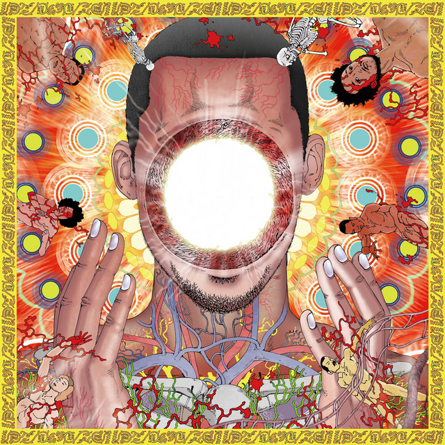
Japanese artist Shintaro Kago specializes in the grotesque, often presenting a psychedelic and naturally discomforting worldview. His art is not for the faint of heart. Kago’s mix of horror and surrealist erotica has garnered him a cult following across the globe.
In the world of ‘You’re Dead!’, a complexly layered Nu-Jazz album about the journey of death, its mysteries, and beyond, Kago uses imagery of body horror and depictions of mass graphic death.
The album also features the Hindu goddess of death, destruction, and power, Kali, reimagined as the enlightened hole-in-the-head version of Ellison (Flying Lotus), which is the album cover as well. As part of the famous ‘ero guro nansensu’ (Erotic Grotesque Nonsense) art movement, Kago's maximalism in exploring death is evident.
Shintaro created 19 separate art pieces for each song on the album. The album cover and imagery tie directly to the album's themes, delving into the journey of life and the experience of death.
The chaotic and surreal elements reflect the complexity and mystery of these concepts. It features a dense and chaotic arrangement of figures, patterns, and symbols, contributing to a sense of visual overload.
Similar to the cover of "Sgt. Pepper's Lonely Hearts Club Band," "You're Dead!" features a highly detailed and complex composition, though it leans more towards surrealism and abstract imagery. Like Kehinde Wiley's vibrant portraits or Yayoi Kusama's immersive installations, the cover for "You're Dead!" uses color and complexity to create a strong emotional and visual impact that has stayed with me since the 10th grade.
5. Led Zeppelin III by Led Zeppelin:
Released: October 5, 1970
Designed by: Zacron (Richard Drew)
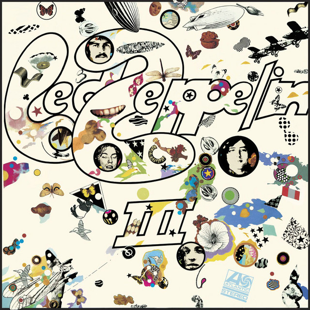
The album cover for Led Zeppelin's "Led Zeppelin III," designed by British artist Zacron (Richard Drew), stands as a distinctive example of maximalist art, mirroring the band's musical exploration and innovation. The creation of this cover was a collaborative process that began in 1970, reflecting the band's desire to break away from traditional rock album aesthetics and create something visually captivating and unique.
The concept for the "Led Zeppelin III" cover was born out of a conversation between Jimmy Page and Zacron, who had studied at Kingston College of Art in London. Zacron was known for his eclectic and surreal artistic style, making him a fitting choice for this project. The idea was to create an interactive album cover that would engage fans on a deeper level.
The cover features a die-cut front with numerous small windows, behind which a rotating wheel (volvelle) is placed. As the wheel is turned, different images appear in the windows, creating a dynamic and ever-changing collage.
Buy "Led Zeppelin III" on Vinyl
This interactive element was innovative for its time and added a playful dimension to the album's presentation. The images on the wheel and cover include a mix of surreal illustrations, photographs, and symbols, drawing from various sources and inspirations.
Within the world of the album itself, the sonics were a departure from the band's previous hard rock sound, incorporating more folk and acoustic elements. The album's musical diversity is reflected in the eclectic nature of the cover art.
The chaotic arrangement of symbols and illustrations mirrors the band's blending of different genres and sounds. The interactive nature of the cover also invites listeners to engage with the album in a more immersive and personal way, much like the diverse and intimate musical experience offered by the tracks within.


Comments